

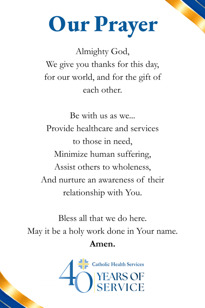
I updated the company’s prayer card design with a cleaner, more modern design and the company’s 40th anniversary branding assets.
I chose a photo that included pastel yellow and blue and overlayed with scattered cross icons from the organization’s logo to keep the design on-brand. I followed the rule of thirds in placing the design elements to keep the design balanced and visually interesting. I isolated the blue and gold ribbon used in the organization’s 40th anniversary assets and applied it to the font and back corners to unify both sides of the card as well as with the rest of the anniversary materials.
I kept the back of the card simple and clean, with branded colors, and the 40th anniversary logo placed at the bottom, balancing out the large blue header.