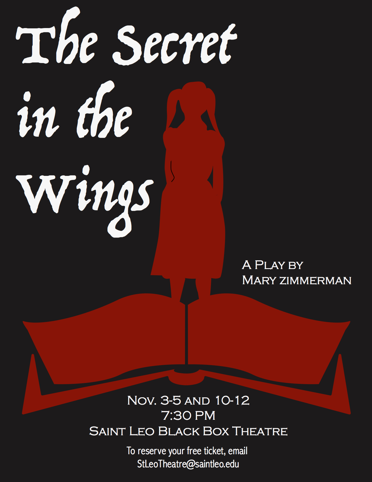
 The purpose of this project was to create a promotional poster mockup for an upcoming play at Saint Leo University. The play centered around fairy tales that come to life as they are being read to a little girl.
To convey this, I chose to design the image with the outline of a girl rising out of the book (with a bit of a wing-like silhouette) below. I chose a dark background to convey the mystery behind the play, and the red and white design and text contrast and stand out against it as the focal point.
To create this design, I first sketched out the silhouette of the girl by hand, scanned the drawing, and traced it with the Pen Tool in Adobe Illustrator. I then drew one side of the book with the Pen Tool, copied it, and reflected it. I placed the girl and the book together.
The primary text is a script font. I think it is appropriate for the fairy tale theme, and it is also very stylized and large to draw viewers’ attention to it before the secondary text. The primary text is aligned left in the left corner, and wraps around the girl on that side.
On the opposite side, the design is mostly dark with the smaller text below that is aligned with the right edge of the book’s page. This creates uneven balance and tension, and leads the viewers’ eyes to view the secondary text after the eye-catching title. The all-capitalized serif font looks formal and contrasts well with the script text.